Module 5: Astrophysics & Machine Learning
This notebook teaches how to forecast a time series in a way that is useful for engineering.
What you’ll learn
- How to do a clean train/test split for time series
- Three forecasting baselines you should always try first:
- Last value (persistence)
- Rolling mean
- Seasonal naive (repeat yesterday)
- How to measure error (MAE / RMSE)
- How to plot forecasts so they’re easy to interpret
Data
We use a toy “space environment” index (inspired by NOAA Kp / solar activity) so the notebook runs offline.
Code
import numpy as np
import pandas as pd
import matplotlib.pyplot as plt

plt.style.use("dark_background")
plt.rcParams.update(
    {
        "figure.dpi": 110,
        "axes.titlesize": 14,
        "axes.labelsize": 12,
        "xtick.labelsize": 10,
        "ytick.labelsize": 10,
        "legend.fontsize": 10,
    }
)

ACCENT = "#00d4ff"
DANGER = "#ff4d6d"
GOOD = "#7CFC00"

print("Environment ready. We'll build and evaluate simple forecasts.")
Environment ready. We'll build and evaluate simple forecasts.
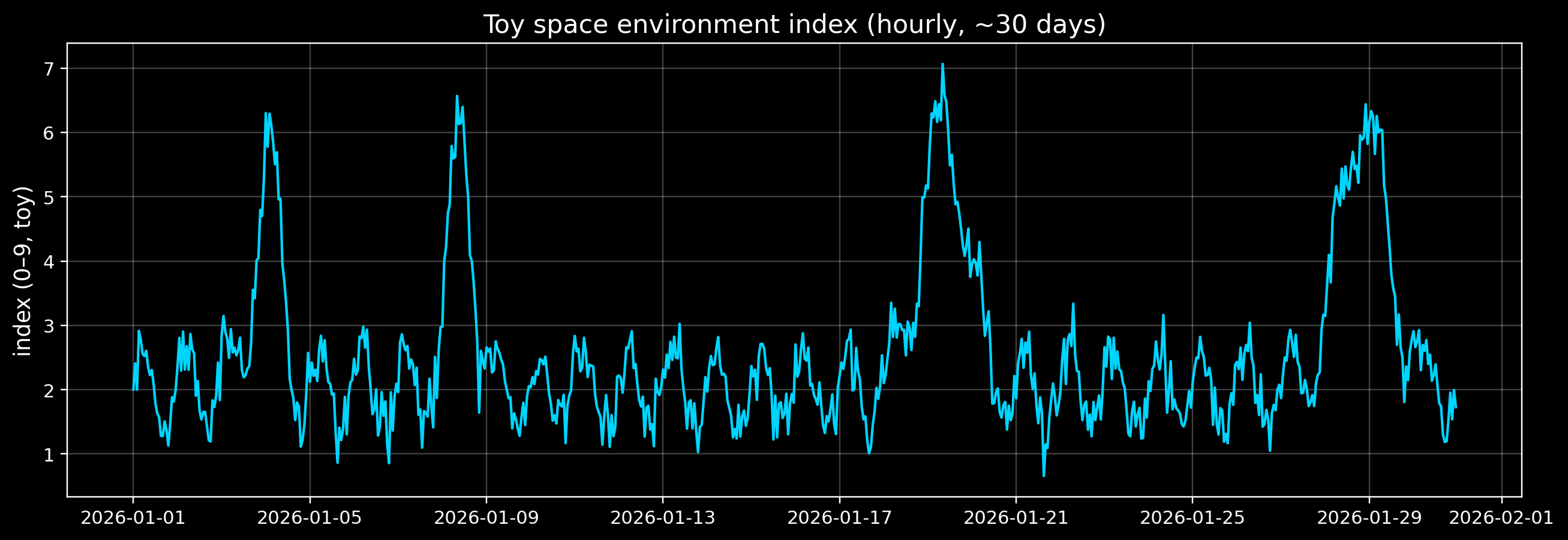
1) Create a toy “space environment index” time series
We’ll generate hourly samples for ~30 days.
We’ll include: - Daily seasonality (things that repeat each day) - Occasional storms (rare spikes) - Noise
This is not a real Kp dataset — it’s just shaped like the problems you’ll see.
Code
rng = np.random.default_rng(2026)

t = pd.date_range("2026-01-01", periods=30 * 24, freq="1h", tz="UTC")
N = len(t)

# Daily seasonality (24h cycle)
hours = np.arange(N)
daily = 0.6 * np.sin(2 * np.pi * hours / 24) + 0.2 * np.cos(2 * np.pi * hours / 24)

# Baseline level + noise
baseline = 2.0
noise = 0.25 * rng.normal(size=N)

# Rare storm spikes
storm = np.zeros(N)
storm_centers = rng.choice(np.arange(24, N - 24), size=4, replace=False)
for c in storm_centers:
    width = rng.integers(6, 14)
    amp = rng.uniform(2.5, 4.5)
    window = np.arange(N)
    storm += amp * np.exp(-0.5 * ((window - c) / width) ** 2)

kp_toy = baseline + daily + storm + noise

# Clip to a plausible-ish Kp-like range (0..9)
kp_toy = np.clip(kp_toy, 0, 9)

s = pd.Series(kp_toy, index=t, name="kp_toy")

fig, ax = plt.subplots(figsize=(12, 4.2))
ax.plot(s.index, s.values, color=ACCENT, lw=1.4)
ax.set_title("Toy space environment index (hourly, ~30 days)")
ax.set_ylabel("index (0–9, toy)")
ax.grid(True, alpha=0.25)
plt.tight_layout()
plt.show()

print("Storm centers (UTC):")
for c in storm_centers:
    print(" -", s.index[c])
Storm centers (UTC):
 - 2026-01-19 09:00:00+00:00
 - 2026-01-08 10:00:00+00:00
 - 2026-01-28 20:00:00+00:00
 - 2026-01-04 01:00:00+00:00
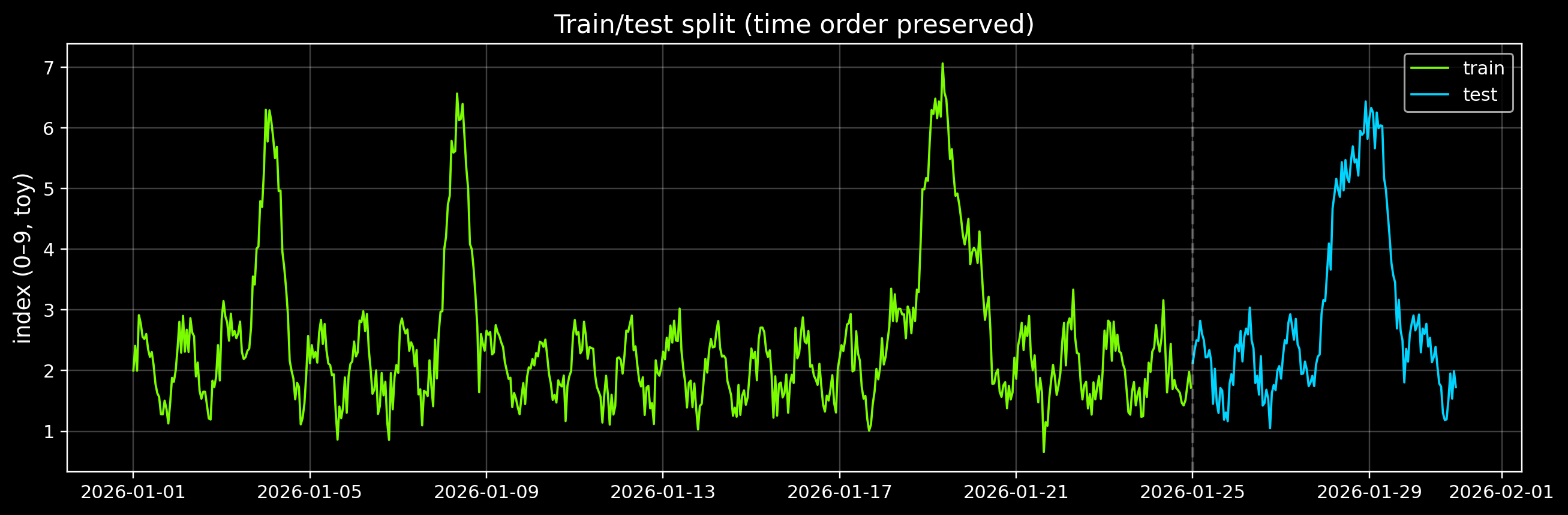
2) Time-series train/test split (no cheating)
For forecasting, we never shuffle.
We’ll train on the first ~80% of time and test on the last ~20%.
Code
split = int(0.8 * len(s))
train = s.iloc[:split]
test = s.iloc[split:]

print("Train:", train.index[0], "→", train.index[-1], "(n=", len(train), ")")
print("Test: ", test.index[0], "→", test.index[-1], "(n=", len(test), ")")

fig, ax = plt.subplots(figsize=(12, 4.0))
ax.plot(train.index, train.values, color=GOOD, lw=1.2, label="train")
ax.plot(test.index, test.values, color=ACCENT, lw=1.2, label="test")
ax.axvline(test.index[0], color="white", alpha=0.25, ls="--")
ax.set_title("Train/test split (time order preserved)")
ax.set_ylabel("index (0–9, toy)")
ax.grid(True, alpha=0.25)
ax.legend(loc="upper right")
plt.tight_layout()
plt.show()
Train: 2026-01-01 00:00:00+00:00 → 2026-01-24 23:00:00+00:00 (n= 576 )
Test:  2026-01-25 00:00:00+00:00 → 2026-01-30 23:00:00+00:00 (n= 144 )
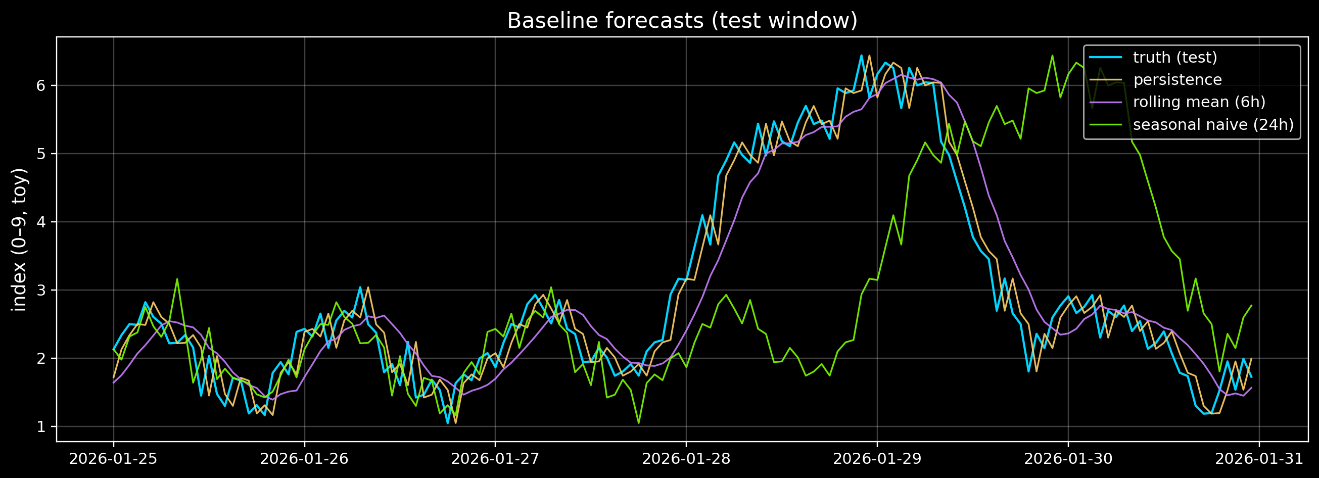
3) Baseline forecasts (start here)
Before fancy models, always try baselines:
- Last value (persistence): (y_t = y_{t-1})
- Rolling mean: average of the last (k) hours
- Seasonal naive: repeat the value from 24 hours ago
If your fancy model can’t beat these, it’s not useful.
Code
def mae(y_true: np.ndarray, y_pred: np.ndarray) -> float:
    return float(np.mean(np.abs(y_true - y_pred)))


def rmse(y_true: np.ndarray, y_pred: np.ndarray) -> float:
    return float(np.sqrt(np.mean((y_true - y_pred) ** 2)))


# Align predictions to the test index
# 1) Persistence: predict last observed value
pers = s.shift(1).loc[test.index]

# 2) Rolling mean (k hours)
k = 6
roll = s.rolling(k).mean().shift(1).loc[test.index]

# 3) Seasonal naive: repeat 24 hours ago
season = s.shift(24).loc[test.index]

# Drop any rows where a baseline can't be computed
valid = (~pers.isna()) & (~roll.isna()) & (~season.isna())

y = test.loc[valid].values
preds = {
    "persistence": pers.loc[valid].values,
    f"rolling_mean_{k}h": roll.loc[valid].values,
    "seasonal_naive_24h": season.loc[valid].values,
}

rows = []
for name, yhat in preds.items():
    rows.append({"model": name, "MAE": mae(y, yhat), "RMSE": rmse(y, yhat)})

df_metrics = pd.DataFrame(rows).set_index("model")
df_metrics = df_metrics.round(3)

display(df_metrics)
| model |
|
|
| persistence |
0.296 |
0.362 |
| rolling_mean_6h |
0.435 |
0.545 |
| seasonal_naive_24h |
1.324 |
1.842 |
Code
# Visual comparison of forecasts on the test window

fig, ax = plt.subplots(figsize=(12, 4.4))
ax.plot(test.index, test.values, color=ACCENT, lw=1.4, label="truth (test)")

ax.plot(test.index[valid], preds["persistence"], color="#ffd166", lw=1.1, alpha=0.9, label="persistence")
ax.plot(test.index[valid], preds[f"rolling_mean_{k}h"], color="#c77dff", lw=1.1, alpha=0.9, label=f"rolling mean ({k}h)")
ax.plot(test.index[valid], preds["seasonal_naive_24h"], color=GOOD, lw=1.1, alpha=0.9, label="seasonal naive (24h)")

ax.set_title("Baseline forecasts (test window)")
ax.set_ylabel("index (0–9, toy)")
ax.grid(True, alpha=0.25)
ax.legend(loc="upper right")
plt.tight_layout()
plt.show()
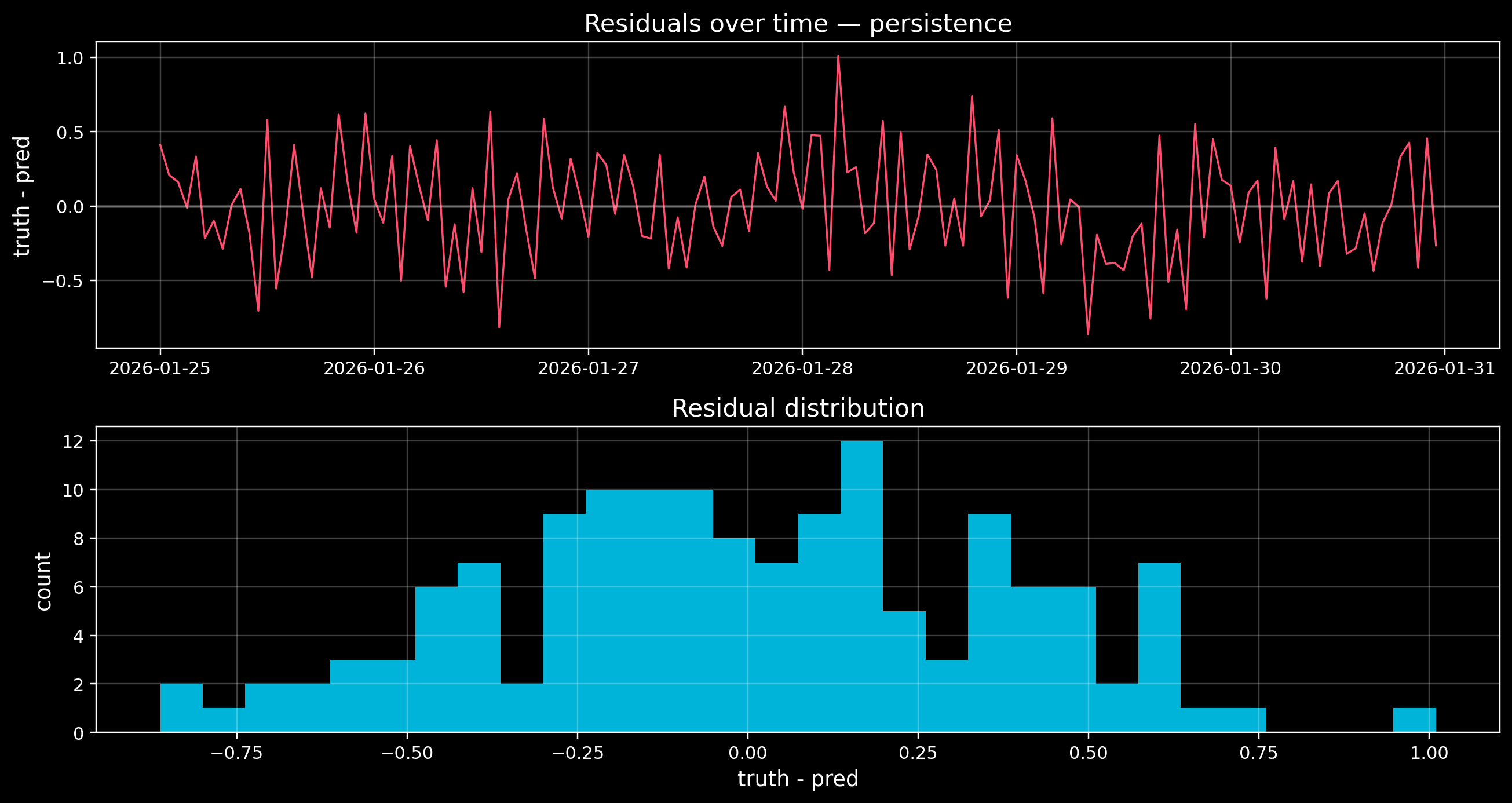
4) Error inspection (a plot is worth it)
Metrics are a summary. You also want to see: - where errors spike (storms?) - whether a model systematically lags or leads
We’ll plot the residuals for the best baseline.
Code
best = df_metrics.sort_values("RMSE").index[0]
print("Best baseline by RMSE:", best)

best_pred = preds[best]
resid = y - best_pred

fig, axes = plt.subplots(2, 1, figsize=(12, 6.4), sharex=False)

axes[0].plot(test.index[valid], resid, color=DANGER, lw=1.1)
axes[0].axhline(0, color="white", alpha=0.25)
axes[0].set_title(f"Residuals over time — {best}")
axes[0].set_ylabel("truth - pred")
axes[0].grid(True, alpha=0.25)

axes[1].hist(resid, bins=30, color=ACCENT, alpha=0.85)
axes[1].set_title("Residual distribution")
axes[1].set_xlabel("truth - pred")
axes[1].set_ylabel("count")
axes[1].grid(True, alpha=0.25)

plt.tight_layout()
plt.show()
Best baseline by RMSE: persistence
5) What can I do next?
- Exercise A: change
k (rolling window). When does the rolling mean become too sluggish?
- Exercise B: add more storms (increase
size=4). Which baseline handles storms best?
- Exercise C: build a tiny “feature model”:
- Use sin/cos of hour-of-day as features
- Fit a linear regression (optional)
Next: in the project track, you can connect these ideas to real NOAA/NASA/ESA time series.