This notebook teaches the basics of space‑style datasets (mostly time series): how to plot them, label units, handle missing data, and detect simple “anomalies”.
What you’ll learn
What “space data” usually looks like (time series, events, images)
How to plot a time series with correct units
How to handle missing samples
Two starter anomaly detectors: thresholds and z‑scores
Important note
We use a tiny toy dataset (generated in code) so this notebook runs anywhere (GitHub Pages build, Binder, Colab). We’ll reference real sources (NOAA/NASA/ESA), but we won’t depend on network downloads.
Code
import numpy as npimport pandas as pdimport matplotlib.pyplot as pltplt.style.use("dark_background")plt.rcParams.update( {"figure.dpi": 110,"axes.titlesize": 14,"axes.labelsize": 12,"xtick.labelsize": 10,"ytick.labelsize": 10,"legend.fontsize": 10, })ACCENT ="#00d4ff"DANGER ="#ff4d6d"GOOD ="#7CFC00"print("Environment ready. Let's work with a small time‑series dataset.")
Environment ready. Let's work with a small time‑series dataset.
1) What is “space data” (engineering view)?
Most “space data” you’ll touch as an engineer fits into a few shapes:
Time series (numbers over time)
Examples: spacecraft battery voltage, temperature sensors, orbit altitude, geomagnetic indices
Events (things that happened at a time)
Examples: engine ignition, safe‑mode entry, conjunction alert, solar flare start time
Images / grids
Examples: Earth observation images, solar images, sky maps
In this notebook we’ll focus on time series, because they show up everywhere: NASA, ESA, JAXA, CNSA, ISRO, commercial operators — everyone has telemetry.
Code
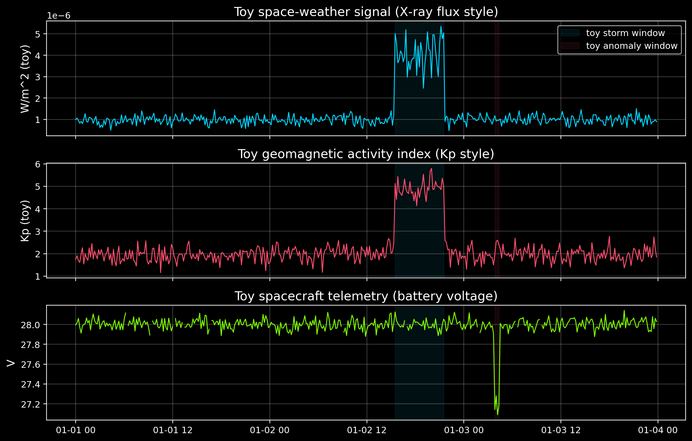
# Create a small toy dataset (10-minute samples over 3 days)## Columns include:# - xray_flux: a toy “space weather” signal (inspired by GOES X‑ray flux)# - kp_index: a toy geomagnetic activity index (inspired by NOAA Kp)# - battery_v: a toy spacecraft telemetry signalrng = np.random.default_rng(7)time_index = pd.date_range("2026-01-01", periods=3*24*6, freq="10min", tz="UTC")# Baselines + noisexray_flux =1e-6+2e-7* rng.normal(size=len(time_index))kp_index =2.0+0.3* rng.normal(size=len(time_index))battery_v =28.0+0.05* rng.normal(size=len(time_index))# Inject a toy "storm" window (x-ray + kp increase)storm_start = time_index[int(len(time_index) *0.55)]storm_end = storm_start + pd.Timedelta(hours=6)storm_mask = (time_index >= storm_start) & (time_index <= storm_end)xray_flux[storm_mask] +=3e-6* (1+0.2* rng.normal(size=storm_mask.sum()))kp_index[storm_mask] +=3.0* (1+0.1* rng.normal(size=storm_mask.sum()))# Inject a telemetry anomaly (battery drop for ~30 minutes)# Think: transient load spike, heater on, sensor glitch, etc.anom_start = time_index[int(len(time_index) *0.72)]anom_end = anom_start + pd.Timedelta(minutes=30)anom_mask = (time_index >= anom_start) & (time_index <= anom_end)battery_v[anom_mask] -=0.8# Add a few missing samples (simulating downlink gaps)missing_idx = rng.choice(len(time_index), size=10, replace=False)battery_v[missing_idx] = np.nan# Build DataFrameunits = {"xray_flux": "W/m^2 (toy)","kp_index": "Kp (toy)","battery_v": "V",}df = pd.DataFrame( {"xray_flux": xray_flux,"kp_index": kp_index,"battery_v": battery_v, }, index=time_index,)print(df.head(3))print("\nMissing battery samples:", int(df["battery_v"].isna().sum()))print("Storm window:", storm_start, "→", storm_end)print("Battery anomaly window:", anom_start, "→", anom_end)
2) Plotting a time series correctly (the “boring” details that matter)
A plot is only useful if it answers: - What am I looking at? (title) - What are the units? (y‑axis label) - What time zone / sampling rate? (x‑axis context)
We’ll also do one key thing that is easy to forget:
Show missing data clearly (gaps are information)
Code
fig, axes = plt.subplots(3, 1, figsize=(11, 7), sharex=True)axes[0].plot(df.index, df["xray_flux"], color=ACCENT, lw=1)axes[0].set_title("Toy space‑weather signal (X‑ray flux style)")axes[0].set_ylabel(units["xray_flux"])axes[0].grid(True, alpha=0.25)axes[1].plot(df.index, df["kp_index"], color=DANGER, lw=1)axes[1].set_title("Toy geomagnetic activity index (Kp style)")axes[1].set_ylabel(units["kp_index"])axes[1].grid(True, alpha=0.25)axes[2].plot(df.index, df["battery_v"], color=GOOD, lw=1)axes[2].set_title("Toy spacecraft telemetry (battery voltage)")axes[2].set_ylabel(units["battery_v"])axes[2].grid(True, alpha=0.25)# Mark the injected windows (storm + anomaly)for ax in axes: ax.axvspan(storm_start, storm_end, color=ACCENT, alpha=0.08, label="toy storm window") ax.axvspan(anom_start, anom_end, color=DANGER, alpha=0.08, label="toy anomaly window")# Keep legend readable: show it onceaxes[0].legend(loc="upper right")plt.tight_layout()plt.show()
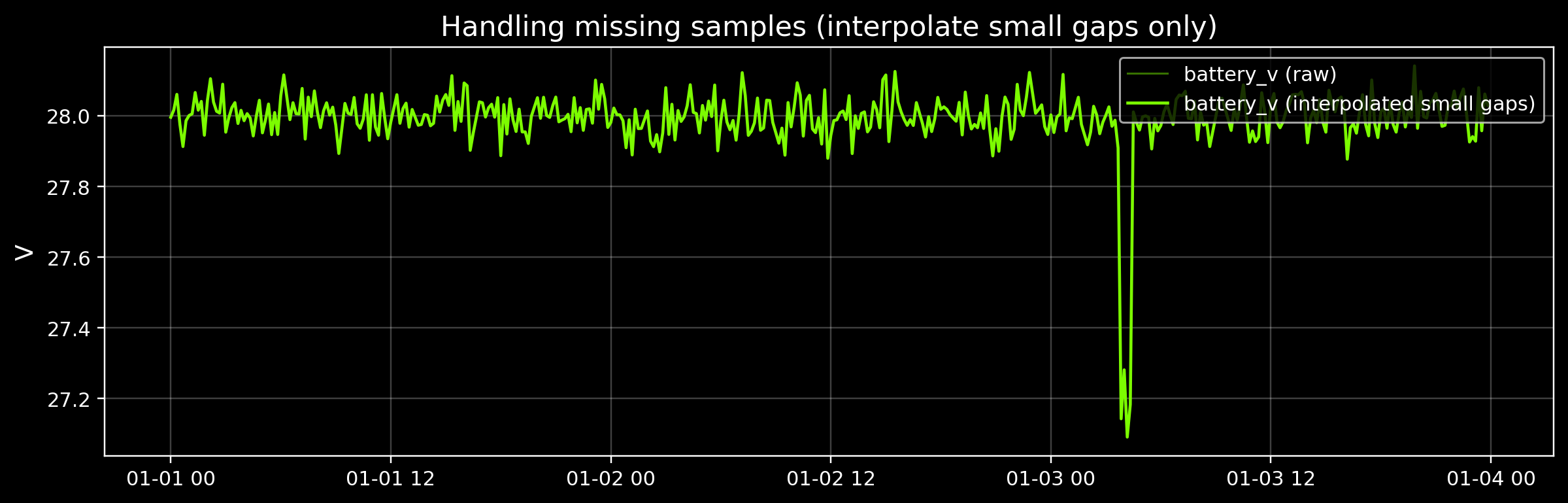
3) Missing data: don’t hide it, handle it
Telemetry gaps happen for many reasons: - downlink coverage gaps - data dropouts - onboard resets - ground processing issues
There is no single “correct” way to fill missing data. Two common approaches: - Leave missing values as NaN (honest; best default) - Interpolate small gaps (useful for plotting; can be dangerous if overused)
We’ll interpolate only small gaps for a derived signal used in anomaly detection.
Code
battery = df["battery_v"]# Interpolate only short gaps (limit=2 means at most 2 consecutive missing points)battery_filled = battery.interpolate(limit=2)print("Missing before:", int(battery.isna().sum()))print("Missing after: ", int(battery_filled.isna().sum()))fig, ax = plt.subplots(figsize=(11, 3.6))ax.plot(df.index, battery, color=GOOD, alpha=0.45, lw=1, label="battery_v (raw)")ax.plot(df.index, battery_filled, color=GOOD, lw=1.5, label="battery_v (interpolated small gaps)")ax.set_title("Handling missing samples (interpolate small gaps only)")ax.set_ylabel(units["battery_v"])ax.grid(True, alpha=0.25)ax.legend(loc="upper right")plt.tight_layout()plt.show()
Missing before: 10
Missing after:  0
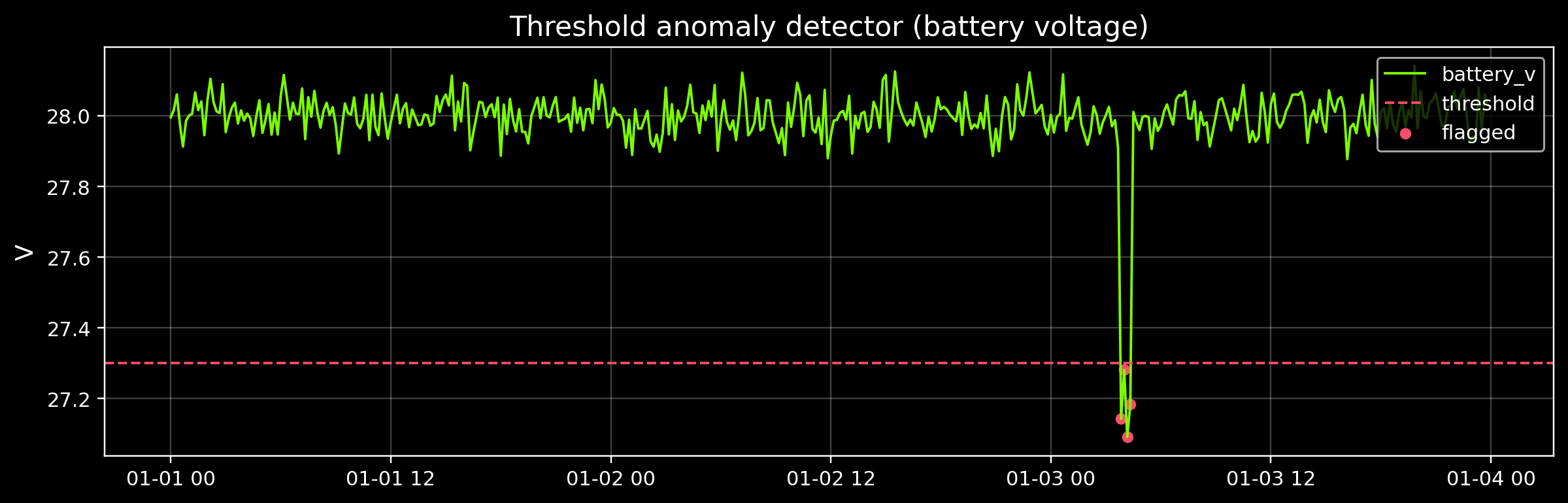
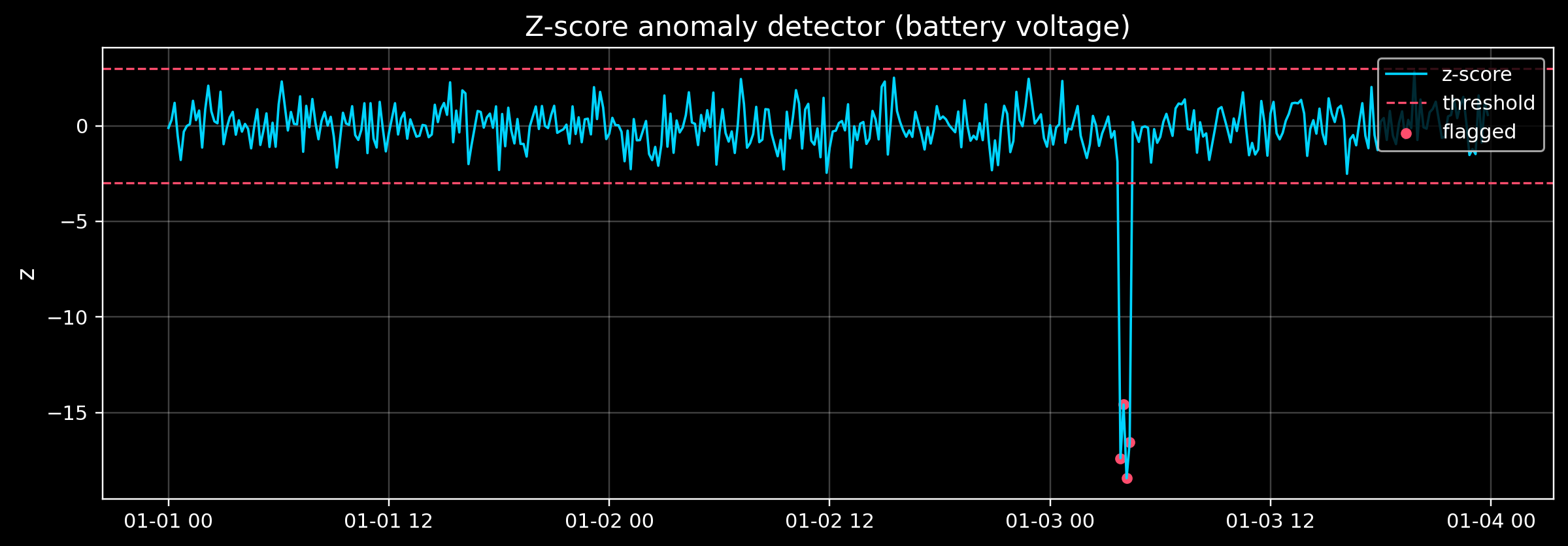
4) Anomaly detection, starting simple
In real missions, “anomaly detection” can mean many things: - A sensor value is physically impossible (negative pressure, temperature beyond range) - A value is plausible but unexpected (slow drift, pattern change) - Many values together look “off” (multivariate anomalies)
We’ll start with two baseline methods you can (and should) try before deep learning:
Thresholds: “Flag anything below 27.3 V”
Z‑scores: “Flag anything more than 3 standard deviations from normal”
These are not perfect — but they’re fast, explainable, and great for learning.
Thresholds are great because: - They’re explainable - They’re fast - They encode real engineering limits
Thresholds are dangerous because: - A system can “fail” without crossing a limit (slow drift) - Limits can depend on mode (launch vs cruise vs eclipse)
That’s why we often add statistical baselines too.
Code
# Baseline 2: z-score anomaly detection## z = (x - mean) / std# We'll compute mean/std from a "baseline" region that is mostly nominal.baseline_end = storm_start # treat everything before the toy storm as "mostly nominal"baseline = battery_series.loc[:baseline_end].dropna()mu =float(baseline.mean())sigma =float(baseline.std(ddof=0))z = (battery_series - mu) / (sigma if sigma >0else1.0)z_threshold =3.0z_flags = z.abs() > z_thresholdprint(f"Baseline mean: {mu:.3f} V")print(f"Baseline std: {sigma:.4f} V")print(f"Z-threshold: ±{z_threshold:.1f}")print("Flags (count):", int(z_flags.fillna(False).sum()))fig, ax = plt.subplots(figsize=(11, 3.9))ax.plot(df.index, z, color=ACCENT, lw=1.2, label="z-score")ax.axhline(+z_threshold, color=DANGER, lw=1.1, ls="--")ax.axhline(-z_threshold, color=DANGER, lw=1.1, ls="--", label="threshold")ax.scatter( df.index[z_flags.fillna(False)], z[z_flags.fillna(False)], color=DANGER, s=20, label="flagged",)ax.set_title("Z-score anomaly detector (battery voltage)")ax.set_ylabel("z")ax.grid(True, alpha=0.25)ax.legend(loc="upper right")plt.tight_layout()plt.show()
Baseline mean: 28.001 V
Baseline std:  0.0494 V
Z-threshold:  ±3.0
Flags (count): 4
5) What can I do next?
Exercise A (thresholds):
Change low_threshold_v up/down.
How does it change false alarms vs missed events?
Exercise B (z-scores):
Change baseline_end (what counts as “normal” data?)
Change z_threshold (2.5, 3.0, 4.0)
Exercise C (multi-signal thinking):
During the toy “storm”, kp_index and xray_flux increase.
What would you expect battery voltage to do in a real system? (No single correct answer.)
Real datasets to explore next (multi‑agency friendly)
NOAA SWPC space‑weather indices (Kp, solar flux)
NASA data portals (mission telemetry / science time series)
ESA open data (Earth observation + space environment)
This notebook intentionally keeps the mechanics simple — you can build smarter models in the next Module 5 notebooks.